
content featuring @ META
Jun - Aug 2022
Internship
Building a flexible, streamlined, and unified content featuring system for the Facebook app.
Aligned with other teams and created consistency for content viewing experiences and card dimensions. Simplified terminology to support user education and adoption.
team
QIANxu zeng (design Manager) | STEPHEN WU (ENG) | JORDAN CRAVEN (CONTENT) + MORE
problem
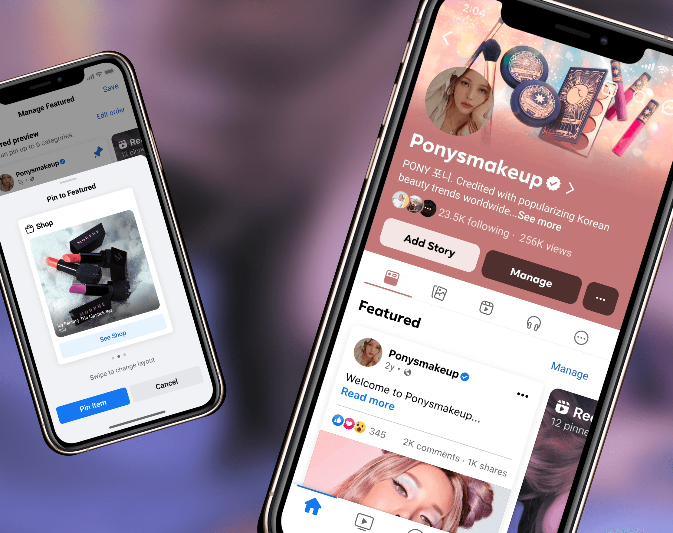
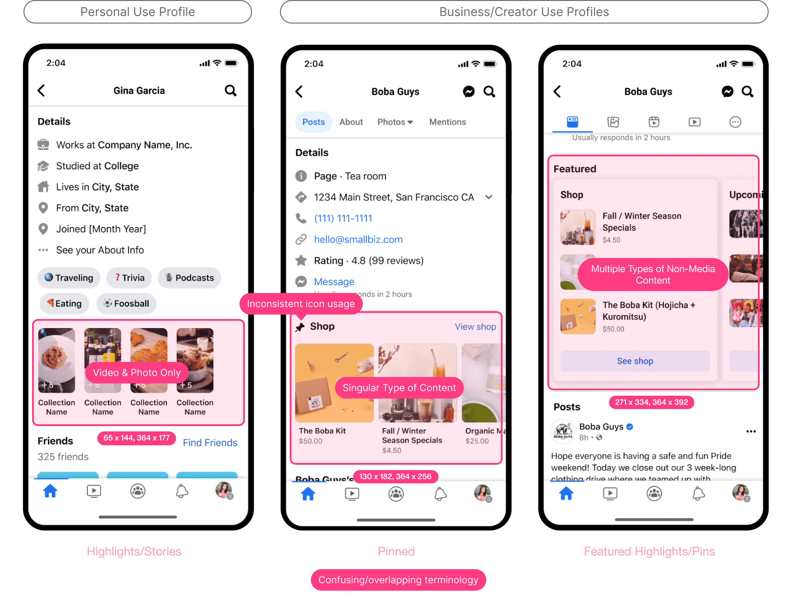
With 3 redundant systems across 5 different profile types, users struggle to feature content in ways that effectively attract relevant audiences.
With these systems comes overlapping and confusing terminology, a lack of user education, limitations on what types of content can be featured, and unnecessary complexity that puts the mental burden on users to figure out the best strategies for their accounts.
A flexible solution
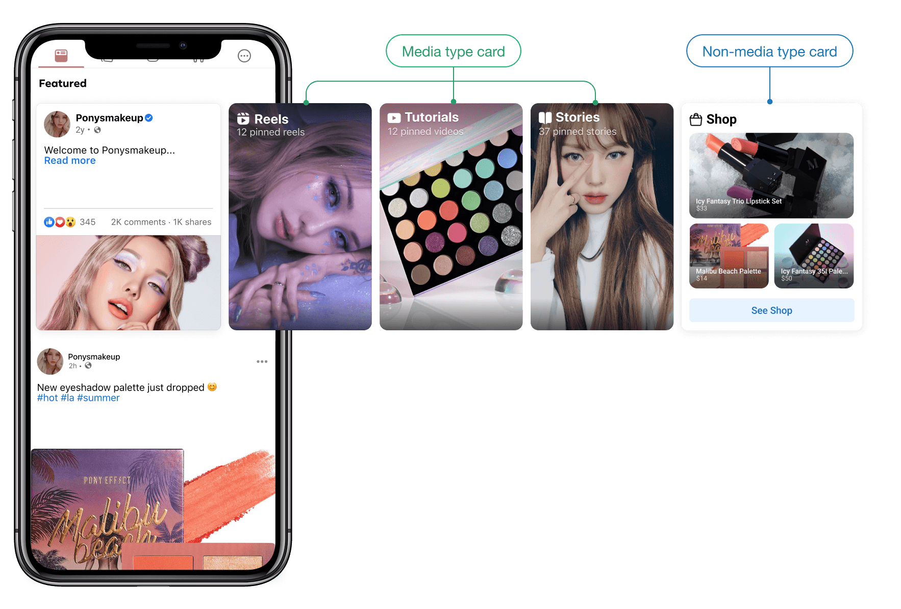
Two types of content cards that allow users to curate the perfect first impression and drive profile connections and metrics.
Replaced the fragmented, multi-system, and constricting starting state with one centralized h-scroll unit that works seamlessly across profile types and use cases.
Details
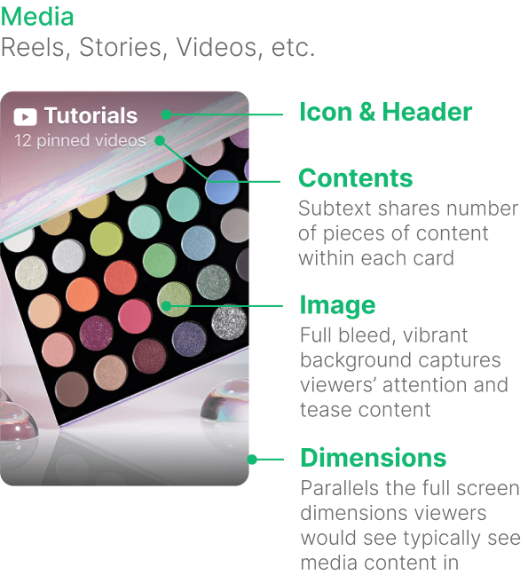
Media type card
Media type cards open into a highly immersive full screen viewer when clicked. When a viewer reaches the end of featured content, they can choose to continue looking at the profile’s other posted content, or return back to the profile page. On the management side, account managers can select content to pin to the media type card.
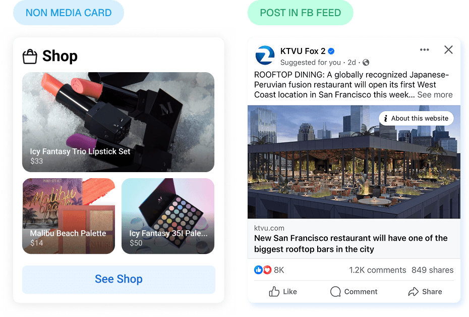
Non-media type card
Media type cards open into a highly immersive full screen viewer when clicked. When a viewer reaches the end of featured content, they can choose to continue looking at the profile’s other posted content, or return back to the profile page. On the management side, account managers can select content to pin to the media type card.

Parallel contexts
Intentionally different card dimensions visually differentiate and emulate the content’s original viewing environments. Tying in context gives users context clues that allow them to intuit how to interact with these cards.

RIPPLE EFFECTS
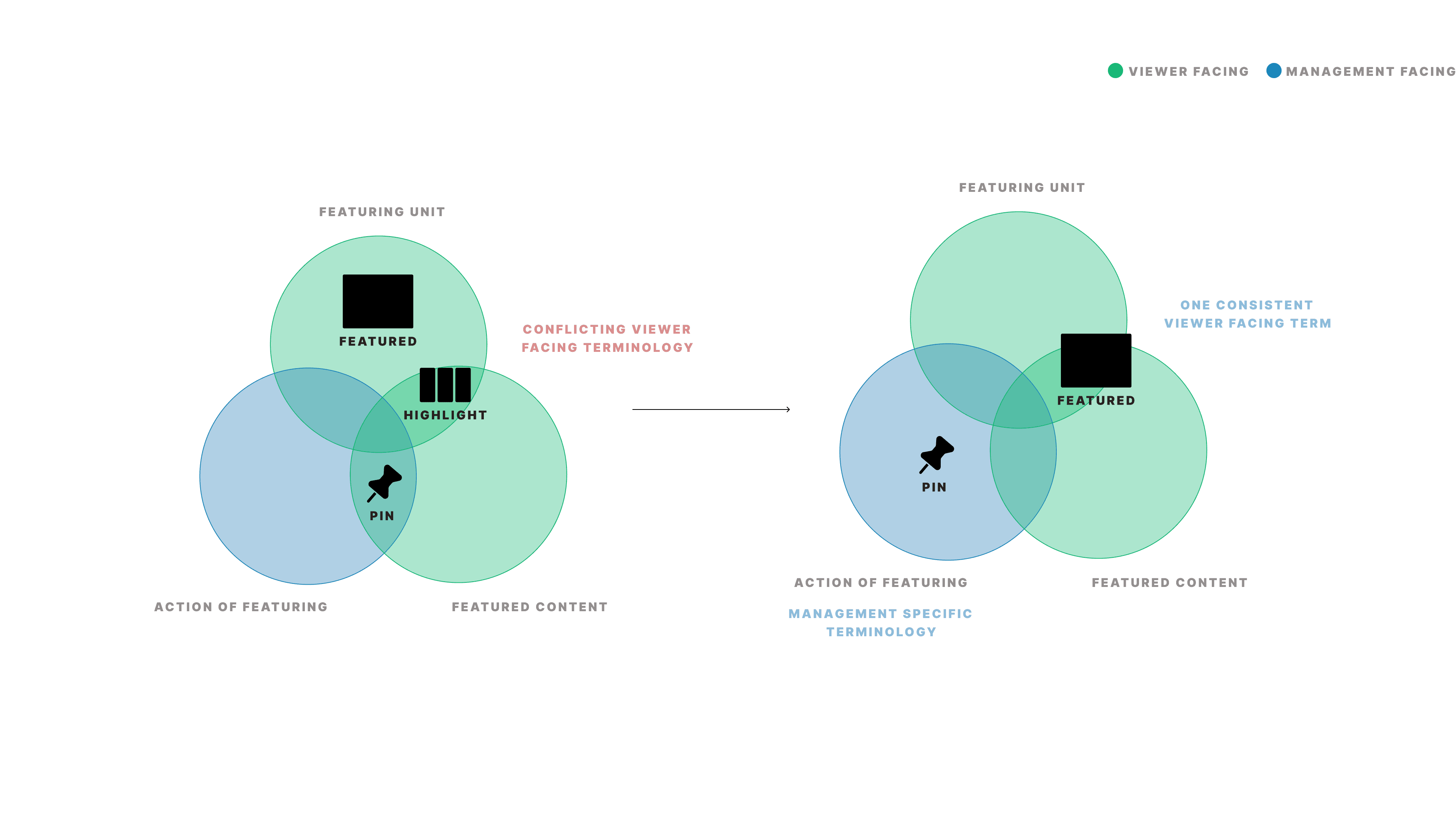
Clarifying and simplifying terminology
Originally, three different but overlapping terms were used for featuring units--Highlight, Featured, and Pin/pinned. The inconsistency in use and colloquial usage of terms added necessary noise and confusion to the platform, which is why I proposed simplifying terminology to just two terms, Featured to refer to the viewer facing side of content featuring, and Pin/pinned to refer to the management action of pinning content to the Featured unit.
Reflections
This project was not only the product of consistent collaboration with the Home team and content design, but also served as a vision for the future of media consumption across the Facebook app as a whole. It showed the power of consistency through the consolidation of content featuring to one simple unit, simplification of terminology, and use of parallel card sizes to anchor card contents to their original contexts. In the process, I built my understanding of user behaviors, interaction patterns, and prototyping.